

2016 Year-End Summary
Imagine that it’s January 1, 2016 and you have a crystal ball that shows you 2016’s headlines. Negative interest rates. Brexit. The U.S. Election. Also imagine that your crystal ball told you that the Dow and S&P 500 would have their worst ever first ten days of the year. Through mid-February, the S&P 500 would drop 11% and many global markets would dip 20%.
Pause and ponder what you would have done to your portfolio.
You likely would have foreseen a bad year for stocks. At the very least, you would have expected a volatile year. Yet…

S&P 500 1-Year Annualized Daily Rolling Volatility since 1929 (source AQR)
S&P 500 1-Year Annualized Daily Rolling Volatility since 1929 (source AQR)
...volatility was about normal. There were big moves (see small cap stocks), but overall the market did not roil as dramatically as the headlines.
As we now know, 2016 humbled many soothsayers. Not only did most experts turn out to be wrong. Often, their expectations for what would happen if their prediction was wrong … also turned out to be wrong.
We’ve hammered on this before but it’s worth repeating at the top of the year – stock market forecasts are mostly folly. Countless variables influence the markets and most of them are unpredictable. Even with 20/20 foresight on certain conditions, there are too many ways – often unforeseeable - for the outcome to surprise.
Stocks
Most broad asset classes were up in 2016. For the eighth consecutive year, the S&P 500 (an index of large U.S. stocks) was positive at 12.0%. Of the eight, last year was the sixth double-digit gain. This is the S&P’s third ever eight year winning streak. There has been one nine-year streak.
The Russell 2000 (an index of small U.S. stocks) gained 21.3%. That alone misses the full story. Small cap stocks dropped 20% over two months through mid-February 2016. They then roared back, gaining 42%. Half of that jump and two thirds of the year-end gain arrived in November and December. Investors who rode through the downturn were rewarded.
Developed international market equities had another middling year, up 2.8%. Emerging market stocks rebounded from three straight negative years to return 11.2%. Emerging markets haven’t outpaced U.S. stocks since 2012.

Since the creation of the MSCI Emerging Markets index in 1988, relative performance of EM and U.S. stocks has been cyclical. As we’ve written recently, emerging market stocks have more favorable valuations than U.S. stocks (see chart in the next section). We’ll see if 2017 starts a new cycle

Valuations
U.S. stocks gained despite warnings from many, ourselves included, that the U.S. market looks expensive, especially relative to international markets.
Our message isn’t that the U.S. market is in a bubble or even that returns are about to turn negative. High valuations simply mean that you should lower expectations for future returns.

Earnings are displayed as a 36-month trailing average. Source: Vanguard.
Earnings are displayed as a 36-month trailing average. Source: Vanguard.
Valuation measures the relationship between price and value (in the chart above it is expressed as earnings). The relationship obeys the law of supply and demand. When price is too high relative to value, demand drops. When price is too low, demand increases.
At any moment, what is “too high” or “too low” is difficult for anyone in the market to know. Partly as a result, reactions are not instantaneous. High prices often continue higher, and low prices go lower. However, over long periods of time the relationship between price and value is relevant.
The following table shows S&P 500 annualized returns for subsequent ten year periods organized by the starting CAPE[1] ratio. As of January 4, 2017, the S&P 500’s CAPE was 28.1. Historically, the average CAPE is 16.7. Today, investors pay two thirds more for earnings than the historical average.

Notice how returns – average and range - decline as CAPE increases. While CAPE does not allow us to predict with any precision, there is a meaningful correlation between the CAPE starting point and future returns.
Also notice that just focusing on average returns would be misleading. Even for the most expensive CAPE range, there have been long periods of significant gains. This explains why investors can be simultaneously pessimistic about future U.S. stock returns and still own a sizable position.
Bonds
Years from now, the most noteworthy financial story about 2016 may be the bottoming of interest rates.
For three decades, rates have declined. This has been great for fixed income investors (when rates decline, the value of already-issued bonds rises).
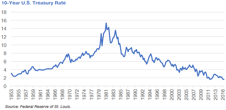
Most investors do not remember a pre-rising rate bond market. Yet from 1941 to 1981, 10-year Treasury rates lifted from 2% to 15%. Imagine how valuable your 2% bond would be when you can purchase bonds paying many times as much.
Interest rates on 10-year U.S. Treasuries hit their all-time low in mid-2016. Since then, rates have risen due to the Fed’s December rate hike, the expectation of more hikes, and belief that the new administration’s economic policies will lead to more growth and inflation.
There have been many spells of rising rates since 1981, so this does not definitively signal a turning tide. But it does provide a warning shot for fixed income investors who may have grown complacent. Rising rates may mean that the past decades’ formula will not work as well in the future.
For the most part, we design fixed income to be portfolio ballast – owned not primarily for growth but for stability during turbulent stock markets and to outpace inflation.
It was relatively straightforward to accomplish these goals in past decades. Inflation was low, so bonds that paid low rates still added value. And due to declining rates, investors could often sell bonds for more than they paid.
If inflation ticks up, then many already-issued bonds will become loss vehicles – returning investors less purchasing power than they invested. And if rates rise, then many bonds will diminish in value.
In recent years, we have oriented our fixed income portfolios to shield against rising rates. Doing so has required giving fixed income managers more latitude and owning a more varied basket of bonds.
Fixed income will be an interesting topic in coming years. We plan to dig deeper in future pieces.
Wrapping Up 2016
Last year was a productive year for most asset classes. Although, as many of you know, returns were not carefree. Investors earned their gains by remaining patient amid bouts of volatility, geopolitical drama, and an internet full of dire predictions.
We’ll end with a quote that sums up 2016 and our outlook on 2017:
“Anyone who isn’t confused doesn’t really understand the situation”
— Edward R. Murrow
[1]CAPE stands for Cyclically Adjusted Price-to-Earnings. It’s a commonly-used valuation metric.